
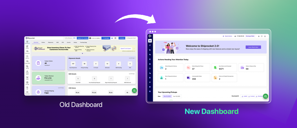
Redesigning a website comes with new hopes and new ideas and the same happened in the case of Shiprocket too. There can be multiple reasons for redesigning a website and we also had more than enough reasons for that. In this blog, we are going to discuss the aspects of every team member involved in the journey of Shiprocket from an old user interface to a new user interface and experience.
The process came into consideration after a survey to learn about the seller’s overall user experience and what they feel where we can improve to make their experience best from good. During the survey, we realized that an outdated website can act as a stumbling block in delivering the best user experience and it really needs to be updated to add freshness and flawlessness. And this is where we got a good catch!
So, to clear all your doubts, here is the list of reasons that motivated us to decide on our journey of Shiprocket from an old user interface to a new user interface. Let’s take a closer look at them!
All Possible Reasons Behind This Change:
Prioritization of User Experience: After a successful survey, we came to the conclusion that knowingly or unknowingly, our seller panel was compromising the user experience (UX) and there can’t be a bigger reason than this.
To fill the Gaps of Old UI: The old user interface had several gaps that needed to fulfill because they were leading to an inconsistent and a lower usability experience for the sellers and we never want our sellers to suffer because of such issues. A common problem that we encountered was a failure to communicate to the users in the right way which was leading us to a lot of misunderstandings and even different interpretations of the same general goals. So, this change was a must.
Improvements in Various Features: Not to deny, Shiprocket is a very vast platform and over time, this platform has witnessed tons of improvements in its features. Our team was so focused to solve the issues faced by our sellers and in between the process, we unintentionally missed our user interface which was leading to major offerings and features getting lost without getting any highlight.
Industry Standards: The user interface was outdated to match the current industry standards and for that reason, information architecture needed to be improved. Intuitive communication throughout the panel is a must and we were missing them because our features were updated but our communication was still the same.
A Survey with Real Users of Panel
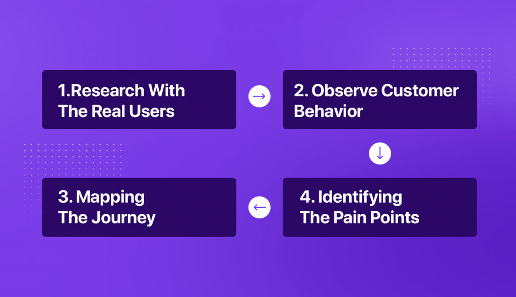
We wanted to gain a common vision of the final product for us and our real users and for this, we conducted a large-scale survey in two phases to bring all our real users under the same umbrella. This helped us in multiple ways like nailing down details such as the look and feel of the site, the brand’s mission and values, and more and also creating a better User Experience (UX) for our sellers.
Phase 1: User Research
To conduct this survey in an effective manner, Shiprocket partnered with an external agency and they helped us to connect with our Shiprocket users with different personas. The major goal of this survey was to identify different pain points and opportunities that existed in the current panel as well as in the market and we actually achieved our goal successfully. Other than the survey among real users, we also conducted a SUS (System Usability Scale) of our old panel to evaluate its usability of it and as expected, we scored low. Scoring low was obvious because we were aware of the drawbacks of our old website design but the survey helped us to identify the right areas of improvements where we needed to stay more focused. We got to know that there are major offerings that we are failing to highlight and we need to bring them up upfront with the help of our new UI.
Phase 2: Usability Testing
Once the initial prototype for some of the key flows of the new panel was ready, we decided to conduct the second exercise of the survey which was SUS (System Usability Scale) so that we could know their response towards it and it was quite positive. Their response was like thumbs up for us to go ahead with the rest of our revamp exercise. After the survey, we were aware of the right direction which can lead us to the great success of our new website design. Once the app revamps were completed, the planning for the web panel revamp started to present an aesthetically and behavior-wise uniform design of the panel.
Our Focused Goals Behind Redesigning
Unified Design: A unified design means the redesigning process with a coherent and logical design that makes it easy for our sellers to navigate and find their way on the panel. So, we applied this uniformity throughout our entire design process which was both aesthetically and behavior-wise uniform.
An Intuitive User Interface: The goal of UI determines how information is presented and how visitors interact with it. The easier our panel is to use, the more sellers will use it. As a result, we want that when our sellers are accustomed to things found in a particular place and function in a certain way, and then only, we can make their experience easier by following the unwritten rules that exist.
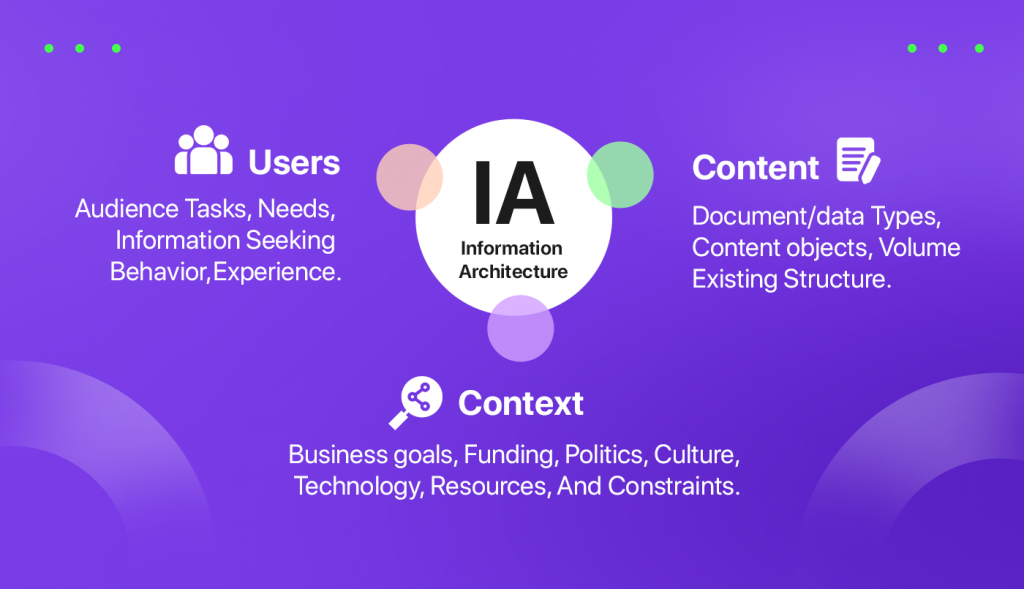
A Superb Information Architecture: Information architecture considers content, context, and users and we wanted to create a superb information architecture for our sellers from scratch that perfectly represents our product information. So, we started with a fresh and modern flavor to deliver an excellent user experience to our sellers.
Challenges Encountered throughout the Redesigning Process
No solution comes without some minor and major problems and we also encountered a few challenges throughout the redesign process of our panel. But not to deny, the journey from the old user panel to the new was really very beautiful. Here are some challenges we faced:
- Planning the project from the scratch and aligning with multiple stakeholders throughout the design and development phases.
- It was a huge project and so was the responsibility. Redesigning existing flows from scratch with an operational platform was definitely challenging for us.
- Time was a key factor throughout the process. Considering the revamp consisted of UX revamp, UI revamp, and then tech development, it was definitely a time-consuming process. But to achieve the best results, it was imperative and non-negotiable.
- Meeting deadlines was too challenging. Especially during the phase 1 launch where we faced multiple challenges as there was a lot learning curve for all teams involved, which made us miss a few deadlines. But ensuring that we had a stable platform which was of primary importance to us.
Final Takeaways!
In this post, we shared the perspective of our UI/UX team and how they decided on the journey of Shiprocket from an Old User Interface to a New User Interface and experience. This is an exciting journey and we are just halfway there as the full product UX/UI Revamp is still on our task list. For the first part of the revamp, we are still noting the responses of our users to know how we need to proceed with the second part of revamp. Throughout the process, we are always so excited to check out the final outcome. We are glad to see that our new user interface is perfectly reflecting the current state of our product. For more such updates around Shiprocket products, stay connected with us!